Inside the Latest Issue
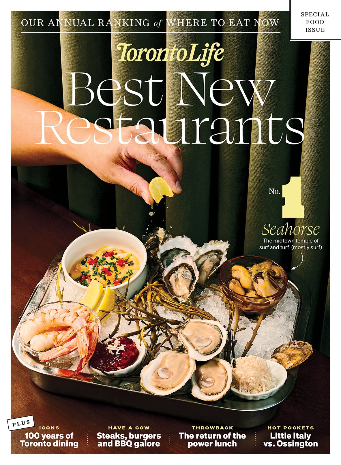
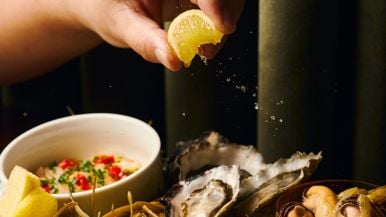
The June issue of Toronto Life features the best new restaurants of 2026. Plus, our obsessive coverage of everything that matters now in the city.
Summer Camp Guide
Wines of the World
Big Stories
Just Listed