Inside the Latest Issue
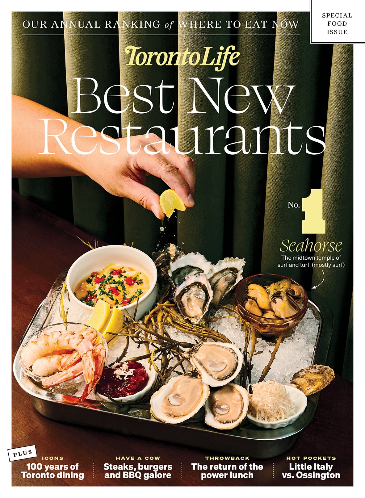
The June issue of Toronto Life features the best new restaurants of 2026. Plus, our obsessive coverage of everything that matters now in the city.
Cost of Living
Urban Diplomat